(WARNING: I am not a professional. This post is just to talk about my method of thinking about or doing things, kind of inspired by this amazing blog.)
INKING
After my pencils are all set up, I ink in the order I learned from
this fine artist:
- letters
- balloons
- panel borders
- everything else
It's the "everything else" I want to write about. To start with I do a rough pencil.

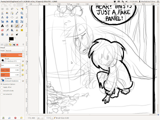
Then, once the words, bubbles, and panel outlines are finished I go over the things that are farthest in the foreground. In this case, it's that adorable little girl-thing from my very own comic, Precious Metal.
I usually try to make the outline thicker than the internal lines. Here I used a computer-pen width of 10.00, but on paper I'd probably use my 08 (and then go over it later with brush pen if it needs a little bit more thickness).
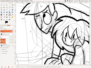
And here I continue with Hubert.
When I ink, one of the main things I focus on is getting correct overlap.
OVERLAP
is one of the tools an artist can use to show depth. It can either be convincing...
...Or not.
It makes a big difference! Pay attention to it!
One of the other things I really focus on is tangents.
TANGENTS,
however, are something to be avoided.
See how the original pencils had the line of the barrel aimed straight for the little point where that guy's fingers come together? One of the red tick marks shows an alternate solution to that problem by bringing the line for the bottom of the barrel up higher, to the middle of the pointer finger rather than right in between the two fingers.
Why so picky? Tangents DESTROY depth--they are just about the opposite of overlap. I get really OCD about them (I have found myself moving the windows on my computer screen around so that they don't tangent each other :P) but they are dangerous.
They can turn a round drawing into a flat one very easily.
So, paying attention to those two things, I go from big to small, out to in, making whatever adjustments I need to along the way.
Inks will ALWAYS look different from the pencil drawings.
That's just the way it is. Use this to your advantage!
You can do things like making an expression stronger.
There are other fine-tuning adjustments you can make, but most of all be happy with what jumps out of your pen.It can be easy to pine for pencils, but be excited about your inks. They need love, too, even if they weren't exactly what you expected. Have fun with the surprises!
Add fine details until you like what you have.
Then use BLACK.
It can accentuate a character (or cover up mistakes, haha)...
...but it is also often very dramatic. I outline the area I want black, even when I'm working on paper. (I fill the empty spaces in later on the computer to save the ink in my pens. :P) I also fix mistakes on the computer--and rest assured, I make a lot--but even on paper, there's always whiteout, so don't worry if you don't get it exactly right. You can also always try again. Don't be afraid to mess up! Sometimes your mistakes will even make something look better!
If you're really frustrated get up and stop looking at your work for a little while. Then go back later with fresh eye. You'll find that most of it isn't as "bad" as you thought it was. :)
Anyway, here it is:
The Finished Product!
Good luck inking!


