Tuesday, November 12, 2013

Getting More out of One Panel: Overlays

An overlay is just what it sounds like: one picture laid over another. Used properly, it's both effective and efficient--in other words, you get more and you use less.

Japanese comics use it often and obviously, to a few different effects.


 Here, in Megumi Tachikawa's Kaitou St. Tail,  it's simply adding information about who is speaking. The character (Lina) wouldn't fit in the "shot" clearly enough to be recognizable unless you used 2 panels. Instead of wasting that space, the artist used an overlay to add the necessary "panel" or information. (You could count this as 1 and a "half" panels, since she breaks the panel border.)

Here's another informational panel-combination using an overlay:
Megumi Tachikawa's Kaitou St. Tail
Instead of "cutting" and flipping around the "camera" to see this important note, the artist simply made an overlay of the necessary information. The arrow pointing to the box also eliminates confusion as to where the note is or how we came to be looking at it.
See how efficient that was?
And wasn't it clear? No confusion --> effective communication.

An overlay can add more subjective information, too. Like how a character feels about a situation...
Megumi Tachikawa's Kaitou St. Tail


...or a person. (This one is from CLAMP, in Cardcaptor Sakura.)

The examples I've used here are Japanese, but it's effective in American comics, too (if less common).

 Here's an extremely effective emotional overlay (or underlay??) by Carl Barks.


 This one from Jake Parker's Missile Mouse #1: The Star Crusher is diagrammatic in nature, communicating where the main character is and the scale of the destruction he's creating.

I've used it, too, and it's really helpful.
 If you ever need to get more into a panel, this is a good way to do it.

Try it out!
 

Thursday, October 10, 2013

Panel Order

When I'm making a comic, I always try to make sure that each page is readable--the audience is able to follow exactly what is going on and in what order the things on the page should be read.

One little trick I've found helpful is this:

Stagger your panels.


The basic idea is to never have your gutters (or panel borders) form a "+"
Instead, offset it a little. I do it all the time.
There's a big and a small off-set on this page.
This helps the reader keep on track left to right rather than fall down the page.

Exception: When you have material that can (should?) be read in any order.

This is an old example of mine in which, as long as A is first and D is last, the panels will still make sense. However, there are much better examples of this in comics where the creator uses this effect to show events occurring simultaneously (such as multiple character reactions to a shocking event).

Doing this one simple thing and playing with it will help your readers know how to read your comic without thinking about it! Then they can get caught up in the characters and story.

Now go make some comics!


EDIT: There is one other exception that I neglected to mention: if you make your pages all with the same layout consistently through the comic, it can be okay to just establish reading order as a matter of habit. However, I still think that can be unnatural and jarring for a reader if they aren't used to your comic pages yet.

Also, comic strips combined into a book don't count because there is a much larger horizontal space above and/or below each strip. In the above suggestions, I'm referring to (1) entire pages (2) with similar gutter width between all the panels.


Monday, August 19, 2013

Eliminate Unnecessary Panels

This was an exercise I did on one of my old comic pages. It helped me immensely.
 On this page, the two characters are stowaways in the baggage car of a train. The guy in the green cape is hungry. The train has just barely started to move and is going extremely slow, so he thinks maybe he'll just hop off and run for the dining car. However, on the the next page we see there are some guards in the way. Here we're setting up the guards panel and...I dunno, maybe getting some humor out of how slow trains are. 

Here's the exercise:

See the last panel of row two? Cover it up. The comic is still completely understandable. Nobody needs to see the car door close.
You still get all the information--that the girl closed the door--simply by skipping from "1" to "3."

It's amazing how much the human mind will assume, if you just let it.
Here's another example on row three:
See how, even without the middle panel, you still get that she reached up and covered his mouth, surprising him?
There's even one more panel that's a good candidate for simple deletion, and with that change made, we get this page:


See how much more importance each panel has? Can you feel the difference?
The original page was like a storyboard. Each action was painstakingly illustrated. A lot of hard work...but it didn't function that well as a comic. Now, each panel has life and vigor. Not only that, but the information is conveyed with fewer drawings, which means less work, and you get a whole extra row of space to use! 
Here's what I figured out from doing this: when unnecessary panels are axed, not only will more information fit on the page, but the reading experience is stronger.

Do this exercise with some of your favorite (or your own!) comics: cover up one panel and see if the previous and the next panel still make sense without it. Whenever I do this with a great comic artist's work (Osamu Tezuka, Carl Barks, Jeff Smith, Bill Watterson, E. C. Segar), I always find that each panel adds something to the story. Taking one out changes the information and the feeling significantly.

I'm not saying eliminate all panels that don't progress the plot directly. There's much to be said for mood and atmosphere (Tezuka especially does it all the time). But there's not anything to be said for wasting your own valuable time and effort. If it doesn't add something, get rid of it.

(There's also combining panels to get more information out of them, but that's another post.)
Until then, good luck with comics!

Thursday, August 8, 2013

Cover Work

I thought maybe the peoples would like to see a few process shots and a final product.

So here they are!
My assignment was graciously afforded me by the talented writer, Zachary Ricks. You can find the book HERE (corny thumbs up)!

 The raw, uncleaned, blood-and-guts lineart. All pen on paper. Perspective weeps as I try to draw a guitar.
 The first steps of digital coloring. Here I was doing some detail work on the suit--giving it some scars from previous battles.
 My first attempt at full color. When I sent it in to the author, he had some minor suggestions.
...Which were REALLY GOOD suggestions. That princess looks way better with her eyes open. Also, I touched up the lighting.

Well, that's it for now. STAY TUNED... But not too tuned, since apparently I never update here. :P

Thursday, April 25, 2013

Handy GIMP shortcuts


I use the GIMP for my work, and I've found that these are the keyboard shortcuts that I use the most. Use them as combos! Try adding ctrl and shift to more tools and see what you get!

Start-up Stuff:

  • Ctrl+1 (,2,3,4,5) = Open the first document in document history (the most recent document you worked on) –or the second-most recent, or the third, and so on up to 9.
  • Ctrl+O = Open
  • Ctrl+S = Save
  • Ctrl+Shift+S = Save as... (aka “Save a copy”)
  • Ctrl+D = Duplicate the current image into a new file
  • Ctrl+E = Export
  • Ctrl+Shift+E = Export to a different file name
  • Ctrl+N = New document
  • Ctrl+Shift+N = New Layer

Tools:

  • N = Pencil
  • P = Paintbrush
  • X = Switch BG and FG colors
  • O = eyedropper (color-picker)
  • Ctrl while using pencil or paintbrush = eyedropper
  • Shift+E = Eraser
  • Shift+B = Fill Bucket
  • [ = Shrink brush size
  • ] = Increase brush size

Manipulation:

  • Ctrl+C = Copy
  • Ctrl+X = Cut
  • Ctrl+V= Paste (but then you have to Anchor it—by mouse-click or by the button underneath the layers)
  • Page Up = Move up a layer
  • Page Down = Move down a layer

Selections:

  • Ctrl+A = Select all 
  • R = Rectangle (and E = Ellipse but I rarely use it)
  • U = Magic Wand (select a contiguous section)
  • Shift+O = Select by color (VERY handy!)
  • F = Free-hand select (lasso)
  • While using ANY selection tool:
    • Shift = add to selection
    • Ctrl = subtract from selection
    • Ctrl+Shift = Intersect with current selection (in other words: “only select inside what is already selected”—helpful for fine-tuning selections by color, for example)
    • Ctrl+I = invert selection

View:

  • + = Zoom in
  • - = Zoom out
  • Space Bar(+mouse move) = Move around the image
  • 1 = 100% view

Monday, April 22, 2013

Inking

(WARNING: I am not a professional. This post is just to talk about my method of thinking about or doing things, kind of inspired by this amazing blog.)

INKING


After my pencils are all set up, I ink in the order I learned from this fine artist:
  1. letters
  2. balloons
  3. panel borders
  4. everything else
It's the "everything else" I want to write about. To start with I do a rough pencil.


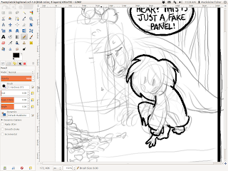
 Then, once the words, bubbles, and panel outlines are finished I go over the things that are farthest in the foreground. In this case, it's that adorable little girl-thing from my very own comic, Precious Metal.

I usually try to make the outline thicker than the internal lines. Here I used a computer-pen width of 10.00, but on paper I'd probably use my 08 (and then go over it later with brush pen if it needs a little bit more thickness).

And here I continue with Hubert.
When I ink, one of the main things I focus on is getting correct overlap.

OVERLAP 

is one of the tools an artist can use to show depth. It can either be convincing...
...Or not.

 It makes a big difference! Pay attention to it!

One of the other things I really focus on is tangents.

TANGENTS, 

however, are something to be avoided.
See how the original pencils had the line of the barrel aimed straight for the little point where that guy's fingers come together? One of the red tick marks shows an alternate solution to that problem by bringing the line for the bottom of the barrel up higher, to the middle of the pointer finger rather than right in between the two fingers.

Why so picky? Tangents DESTROY depth--they are just about the opposite of overlap. I get really OCD about them (I have found myself moving the windows on my computer screen around so that they don't tangent each other :P) but they are dangerous.
They can turn a round drawing into a flat one very easily.
So, paying attention to those two things, I go from big to small, out to in, making whatever adjustments I need to along the way.

Inks will ALWAYS look different from the pencil drawings. 

That's just the way it is. Use this to your advantage!
You can do things like making an expression stronger.

There are other fine-tuning adjustments you can make, but most of all be happy with what jumps out of your pen.It can be easy to pine for pencils, but be excited about your inks. They need love, too, even if they weren't exactly what you expected. Have fun with the surprises!

Add fine details until you like what you have.

Then use BLACK.

It can accentuate a character (or cover up mistakes, haha)...

...but it is also often very dramatic. I outline the area I want black, even when I'm working on paper. (I fill the empty spaces in later on the computer to save the ink in my pens. :P) I also fix mistakes on the computer--and rest assured, I make a lot--but even on paper, there's always whiteout, so don't worry if you don't get it exactly right. You can also always try again. Don't be afraid to mess up! Sometimes your mistakes will even make something look better!
If you're really frustrated get up and stop looking at your work for a little while. Then go back later with  fresh eye. You'll find that most of it isn't as "bad" as you thought it was. :)

Anyway, here it is:

The Finished Product!

 Good luck inking!

Friday, March 15, 2013

Long Time, No See

Ok, I feel bad. It's been like forever, and I haven't put any updates here since that inane Skeletor drivel. So...

Here's an update!

I've been learning a lot lately about color and lighting. This is one of my first successful attempts.

This guy isn't anybody in particular--he's just a test dude. There's some problems here, of course, bu I feel like I really started to understand some things. A special thank you to this tutorial. The most useful piece of information for me was about half-way down the page: the author talks about lighting and how to shade it. Gold-seven points out something I hadn't thought of before: all light has a color. And that fact makes sense of something I'd heard a lot before: "shade in a complimentary color." See, I didn't realize that the shadow's color should be opposite the light's. I had thought of it as a compliment to the object's color. So, on a red ball, the shadow would be green; on a blue ball in the same scene it would be orange.
You can see I tried a bit of that in this picture:

Notice that it looks fairly muddy. I mean, there are more problems here than just the lighting, but the shading isn't really helping anything. It's all kind of a mish-mash, with the color of the shadows on Cucumber (that little fella) not really matching the background. The whole effect is that he doesn't look like he's standing in the scene--just sorta floating. Like he's been poorly photoshopped in. :)

One last thing: now that I know this (fairly obvious) "secret," it's possible to (a) direct the eye better and (b)create some very dramatic mood. Like so!

Anyhoo. Hope you enjoyed that! (see, I can be non-inane)